Goals and Opportunities
Take the current mobile product to the next level with updated design, enhanced usability and create new mobile only products. The new design should drive new user acquisition, retention.
Take the current mobile product to the next level with updated design, enhanced usability and create new mobile only products. The new design should drive new user acquisition, retention.
My Role
• Grow the mobile side of design team
Focus on Mobile first initiative
Focus on Mobile first initiative
• Conceptualize new products
Work with product on forward thinking big picture ideas that take advantage of mobile devices
Work with product on forward thinking big picture ideas that take advantage of mobile devices
• Research
Research our current customer personas and find new ones for our mobile only users
Research our current customer personas and find new ones for our mobile only users
• Design End to End
Design all flows, wireframes and prototypes, for all platforms
Design all flows, wireframes and prototypes, for all platforms
• Test
Test with internal employees and external customers.
Test with internal employees and external customers.

A few of the challenges
• IOS and Android apps experiences inconsistent
Look and feel, in text tone, and various flows were not matching
Look and feel, in text tone, and various flows were not matching
• Consent and new user onboarding were long and non trustworthy
Company is based on trust and consent, important to clean up
Company is based on trust and consent, important to clean up
• Outdated visually
End to end experience did not align, users coming from web, to mobile would get confused
End to end experience did not align, users coming from web, to mobile would get confused
• Hardcoded fonts and frameworks
No current style guide or dev component unity
No current style guide or dev component unity

My design focus
• Keep mobile first persona in mind
• Keep mobile first persona in mind
• Update to minimal modern UI
• Simple Intuitive experience
Easy to read, science data, is sensitive emotional
Easy to read, science data, is sensitive emotional
• Innovate
Add product features to take advantage of mobile capabilities
Add product features to take advantage of mobile capabilities

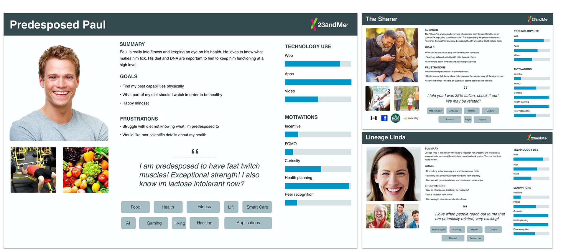
Research consumer habits
- Gathered all historical research from our web product, identify all our use cases and potential different personas.
- Story’s, frustrations, traits and user needs.
- Gathered all historical research from our web product, identify all our use cases and potential different personas.
- Story’s, frustrations, traits and user needs.

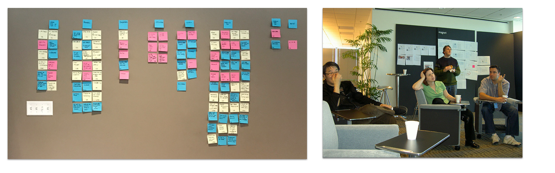
Affinity mapping and brainstorming
- Record ideas on separate sticky notes.
- Look for ideas that seem to be related in some way and place them side by side or string together connections.
- Begin discussions with my team.
- Record ideas on separate sticky notes.
- Look for ideas that seem to be related in some way and place them side by side or string together connections.
- Begin discussions with my team.

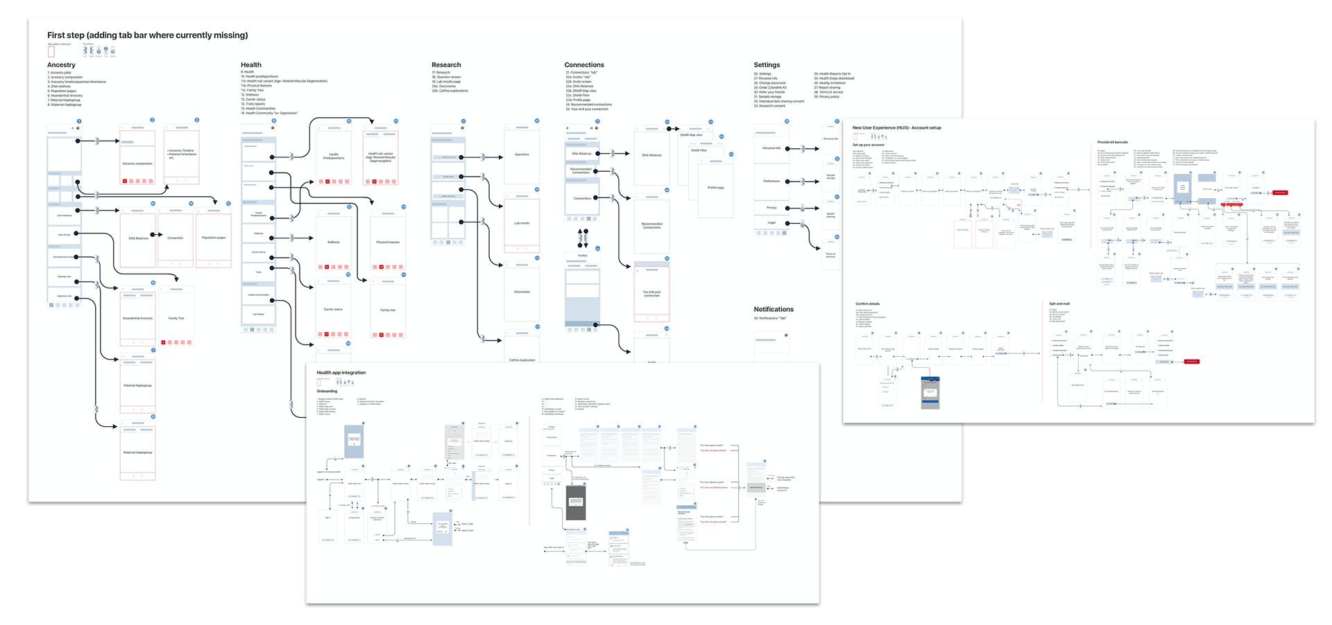
Next stage: Create IA Maps of current framework
- Created over 10 maps with detailed interaction based on primary use cases.
- Goal was to find inconsistency’s in navigational back-stacks.
- Consolidate new user onboarding flow while cleaning up navigation to eliminate any confusion we found in testing.
- Over 5 product pillars with multiple PM’s and 230 plus screens.

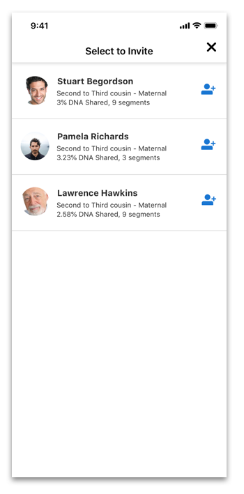
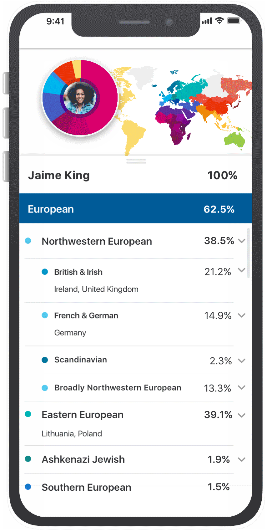
Get tactical (DNA Relatives portion of project)
- DNA Relatives is an area our users would go into to search, view and add potential family members. The bread and butter of connections.
- DNA Relatives is an area our users would go into to search, view and add potential family members. The bread and butter of connections.
Think big, start small and work fast
How might we:
• Improve searching
How might we:
• Improve searching
• Create delight
• Simplify the current confusion
• What if’s

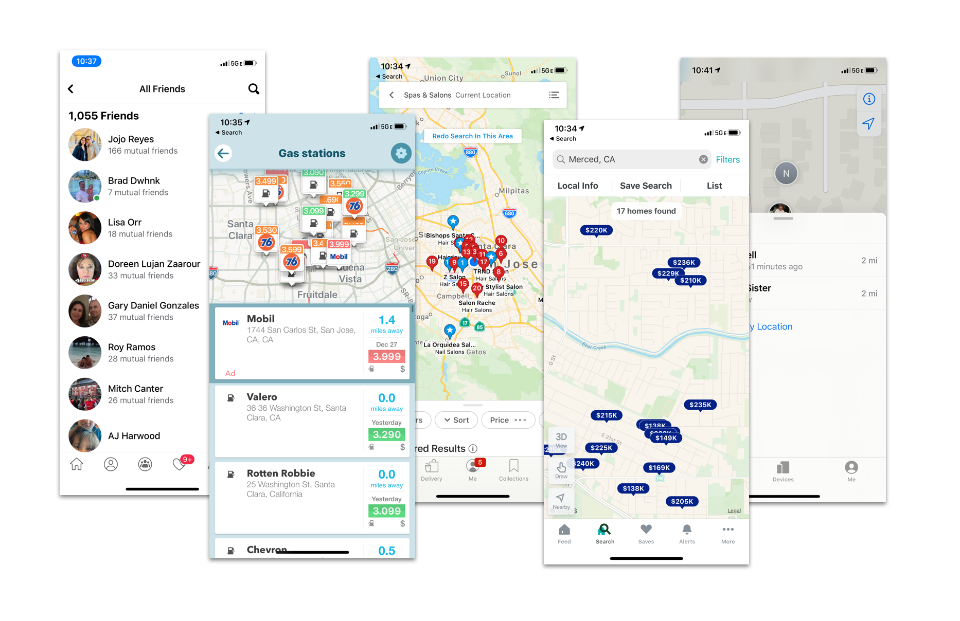
Research others
- Research other applications with similar functions and see how we can improve on the experience.
- What are the trends, what are people used to. What works, what doesn’t...
- Examples: Yelp, Facebook, Waze, Google Search and others…
- Research other applications with similar functions and see how we can improve on the experience.
- What are the trends, what are people used to. What works, what doesn’t...
- Examples: Yelp, Facebook, Waze, Google Search and others…

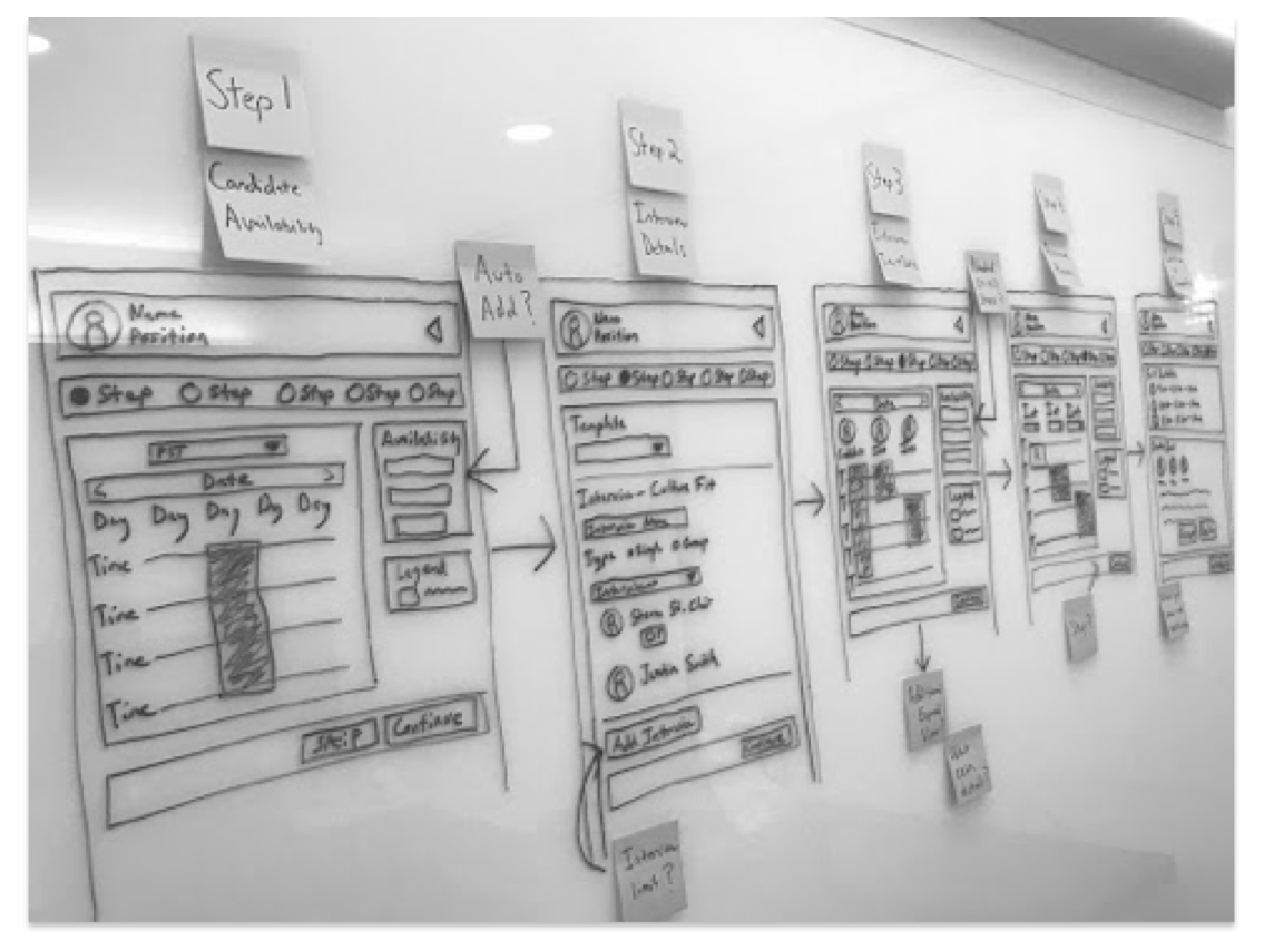
Turn sketches into flows and wireframes
- Begin high level block flows.
- Ideate and shop around to teams and internal designers.
- Begin high level block flows.
- Ideate and shop around to teams and internal designers.
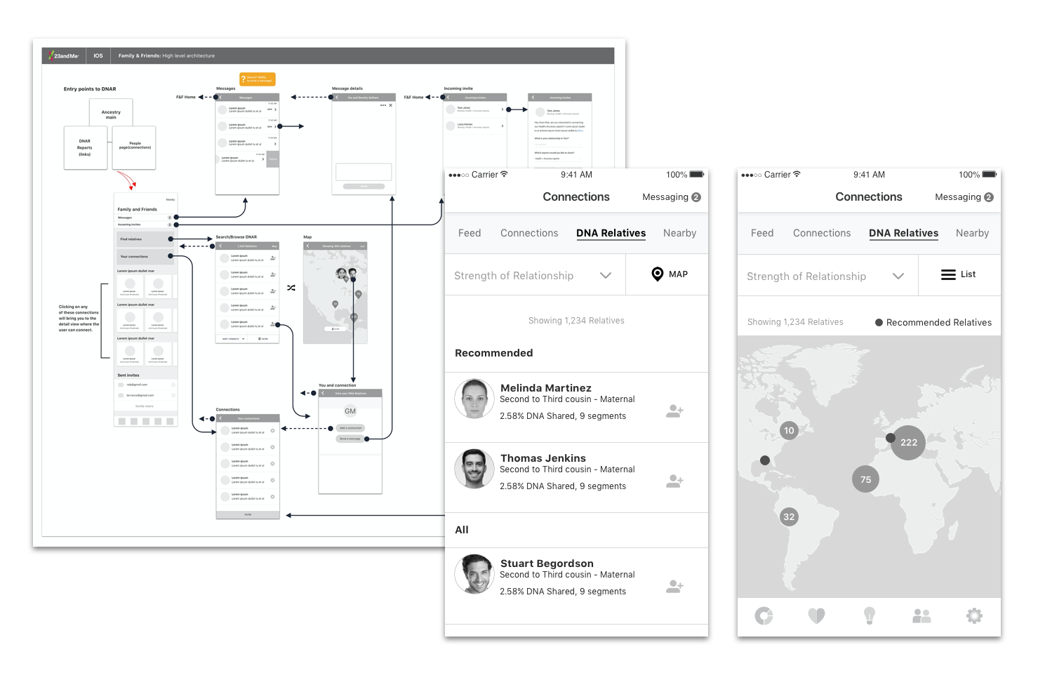

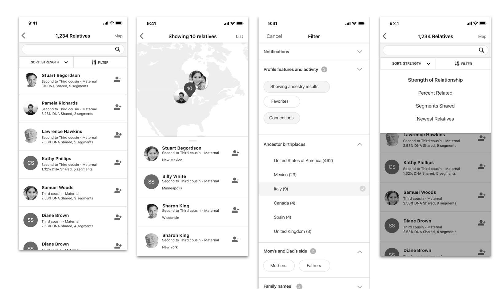
Best tested scenario
- Toggle interaction interface from List/Map view with the ability to filter easily.
- Search and Filter were highest priority.
- Map view was secondary when searching for relatives (made it a click away).
- Interaction took advantage of mobile swipe, pinch and zoom if users wanted to search by location.

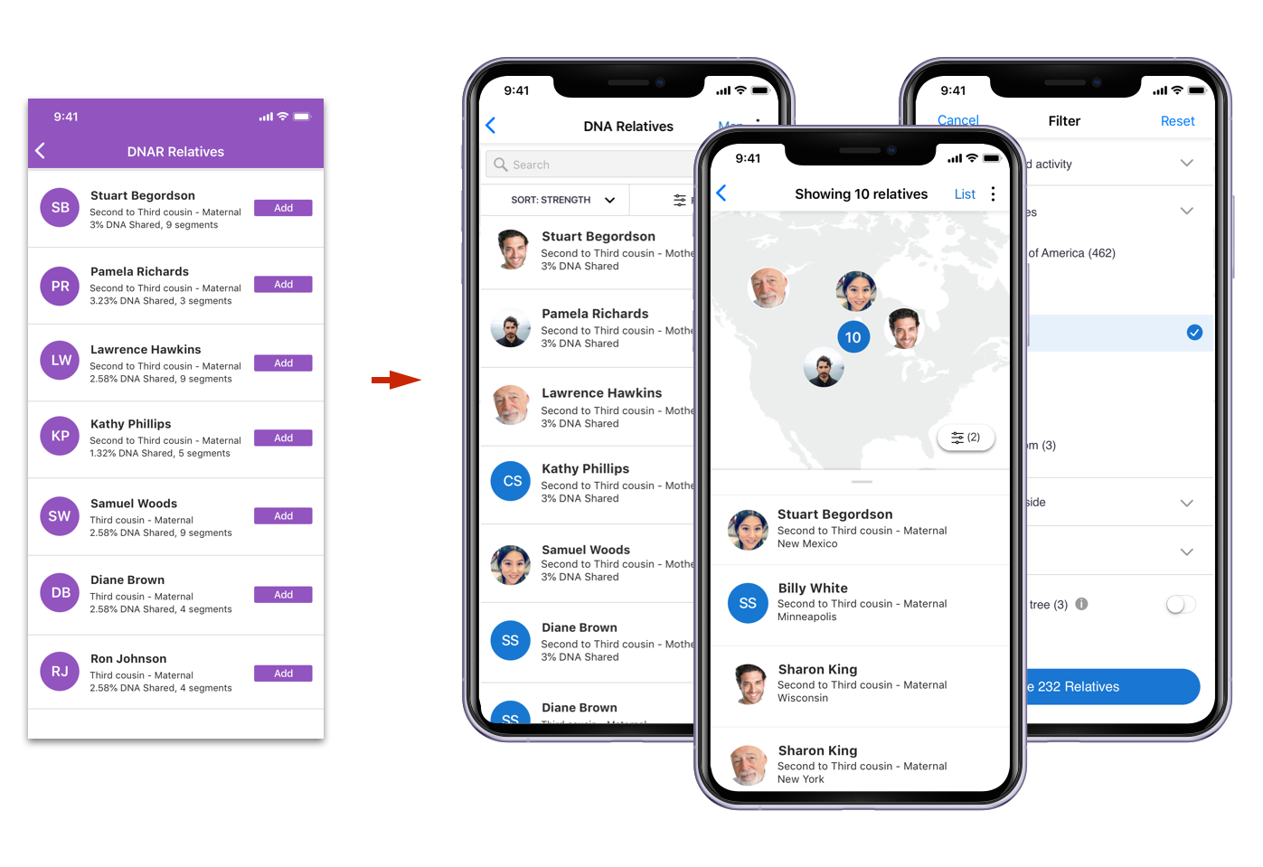
Before/After
- Visual design was considered light, functional and not visually overwhelming with colors like the rest of our app.
- The focus was to get the user to the potential relative and quickly and easily add them.
- Areas with utility would be less visually overwhelming and more functionally focused.
- Visual design was considered light, functional and not visually overwhelming with colors like the rest of our app.
- The focus was to get the user to the potential relative and quickly and easily add them.
- Areas with utility would be less visually overwhelming and more functionally focused.

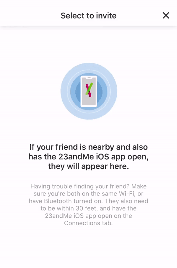
Connect to others nearby
Use case: If users are at a family party or in the vicinity of potential friends on 23andMe, how can we connect?
Use case: If users are at a family party or in the vicinity of potential friends on 23andMe, how can we connect?

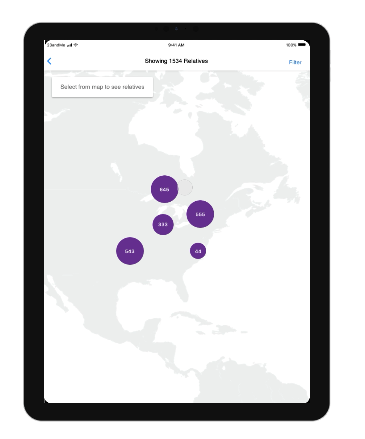
Tablet view
Experience differed slightly based by device and was well thought out given those use cases.
Experience differed slightly based by device and was well thought out given those use cases.
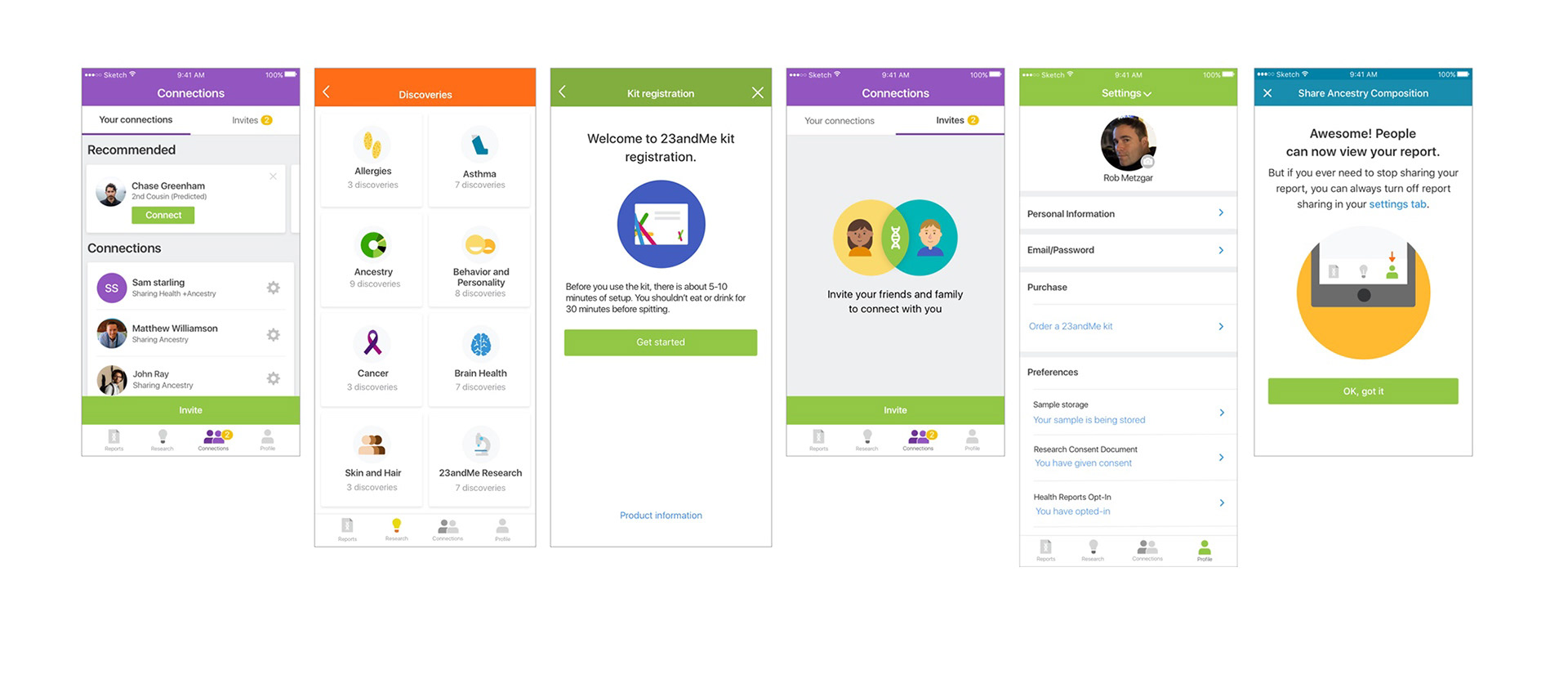
Original design suite
Design outdated, IOS/Android platforms not consistent, hardcoded frameworks and no consistency end-to-end.
Design outdated, IOS/Android platforms not consistent, hardcoded frameworks and no consistency end-to-end.

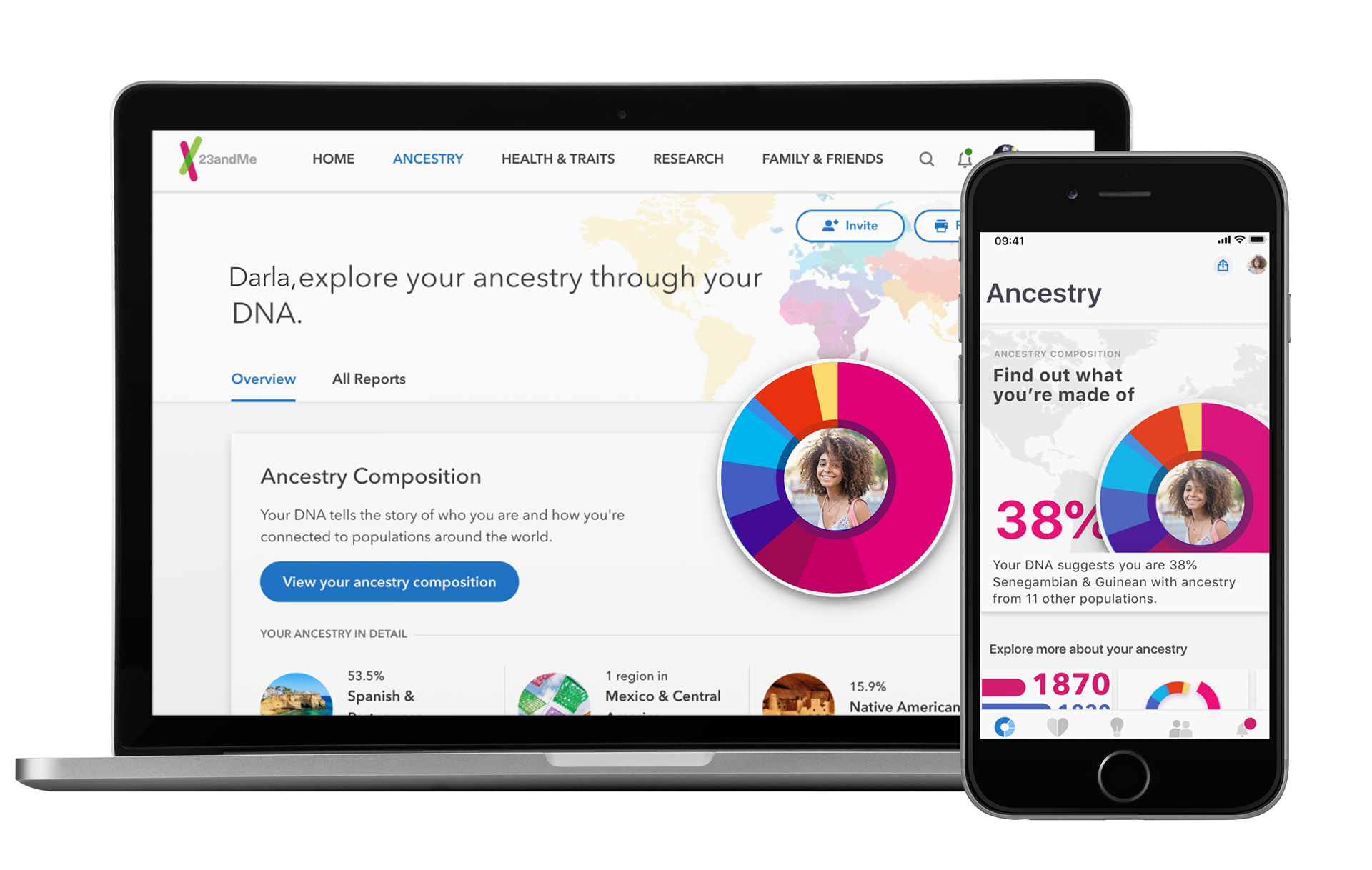
2018 Redesign
First step was to unify the look and feel across pillars on IOS/Android.
First step was to unify the look and feel across pillars on IOS/Android.


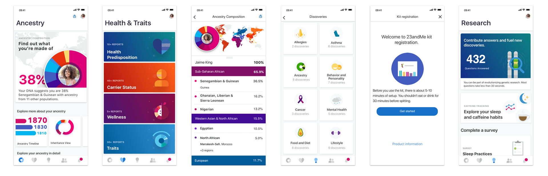
2019-2020 Redesign
Next iterations were to align with our web product visually and produce new ideas that are only capable with mobile devices. We decided to update our components with a lighter look and feel and follow trending styles.
Next iterations were to align with our web product visually and produce new ideas that are only capable with mobile devices. We decided to update our components with a lighter look and feel and follow trending styles.
Various micro interactions were explored

Sample promotional visuals
Email templates and splash page updates produced
Email templates and splash page updates produced
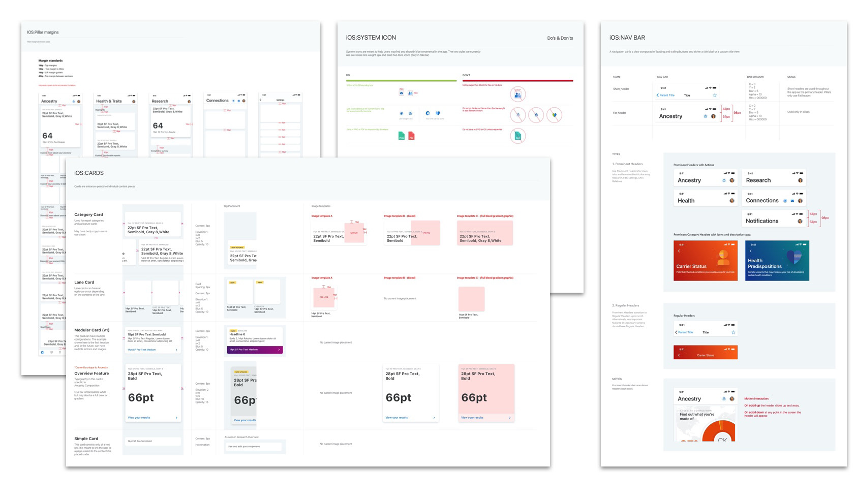
Style guide and sketch components
Created full style guide with developer rules and sketch components for designers.
Created full style guide with developer rules and sketch components for designers.