Satori.com

What is Satori?
Satori is a technical infrastructure to allow Machine Zones, Game of War players from all over the world to communicate in real time.
Satori is a technical infrastructure to allow Machine Zones, Game of War players from all over the world to communicate in real time.
Goals and Opportunities
Redesign a codebase portal into an inspiring, easy to use, developer site that will help drive specific users into creation of new applications that work with real time data.

My Role
• Design a developer focused user experience
• Create a new look and feel and restructured the information architecture
• Test and presenting research
• Inspire and inform

Whiteboarding and Heuristic evaluations
• Evaluate current product
• Evaluate current product
• Hueristic evaluations and interviews


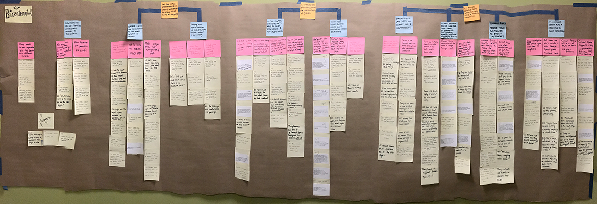
Map the current landscape
Initial stakeholder interviews were consolidated and we affinity mapped the most important areas we thought the developer portal should focus on.

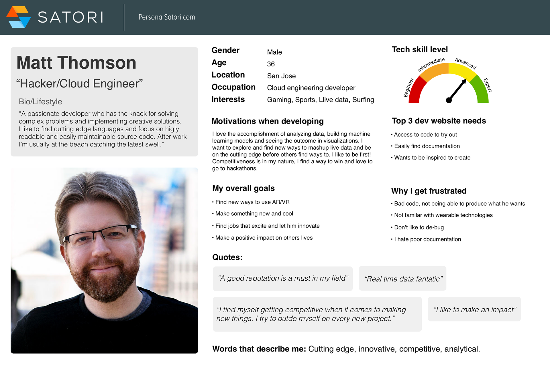
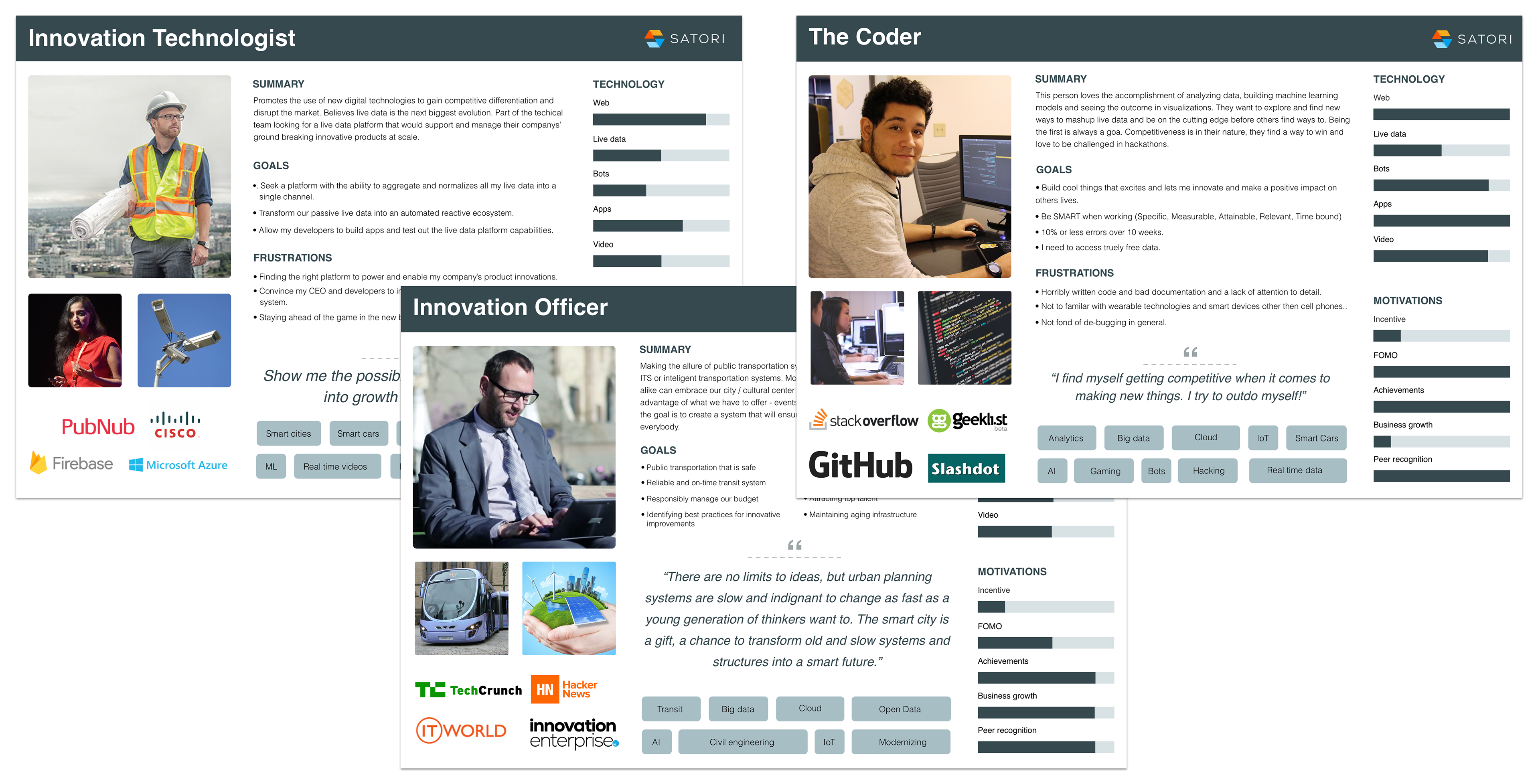
Personas
After the affinity mapping process we began to group into the Personas we wanted to focus on. We kept them high level as we knew there would be various sub-personas. The focus was on the Hacker/Cloud Engineer, Innovation technologist, The Coder, and The innovation officer.
After the affinity mapping process we began to group into the Personas we wanted to focus on. We kept them high level as we knew there would be various sub-personas. The focus was on the Hacker/Cloud Engineer, Innovation technologist, The Coder, and The innovation officer.

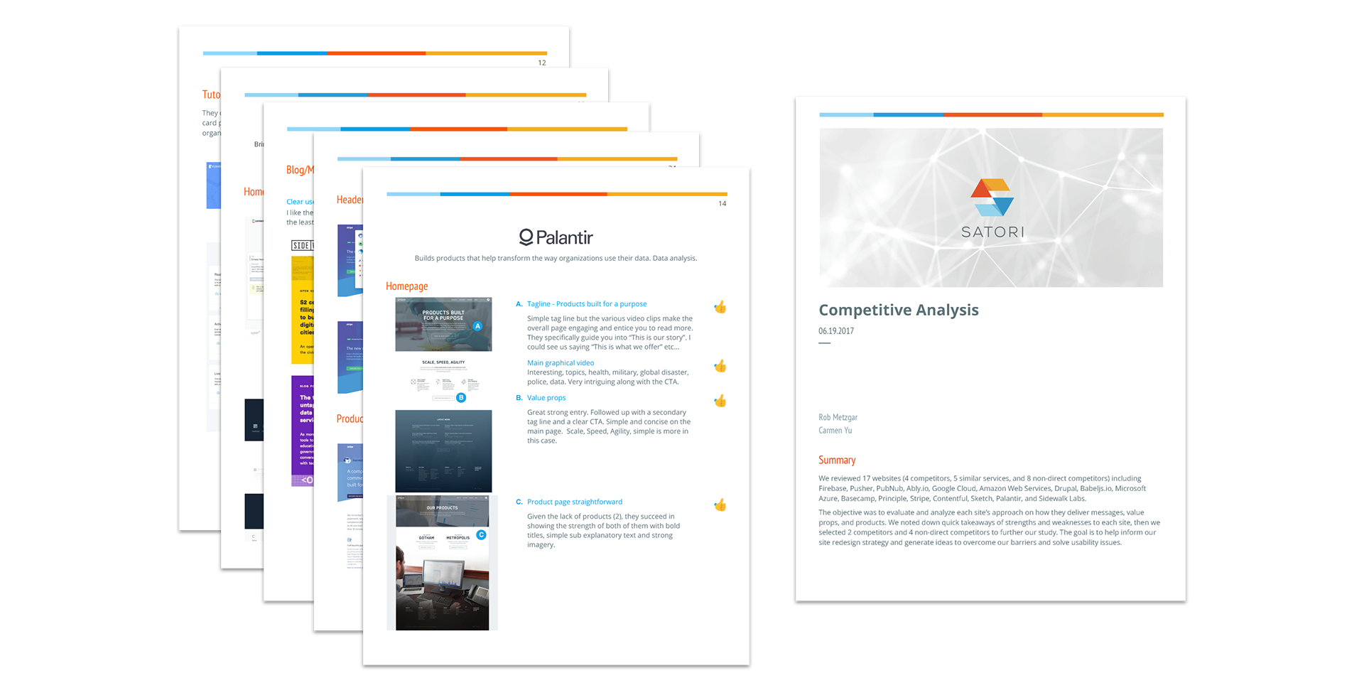
Competitive Analysis documentation
I created documentation on competitors and presented findings to our dev and product team.
(value props, onboarding flows, strengths and weaknesses)
(value props, onboarding flows, strengths and weaknesses)

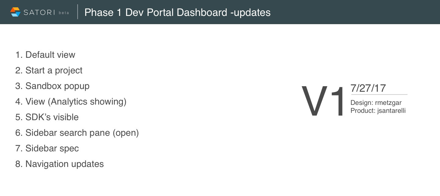
Home page / Sidebar help documentation specifics
Design consisted of various updates
Design consisted of various updates

Map contextual onboarding
• Maximize working space
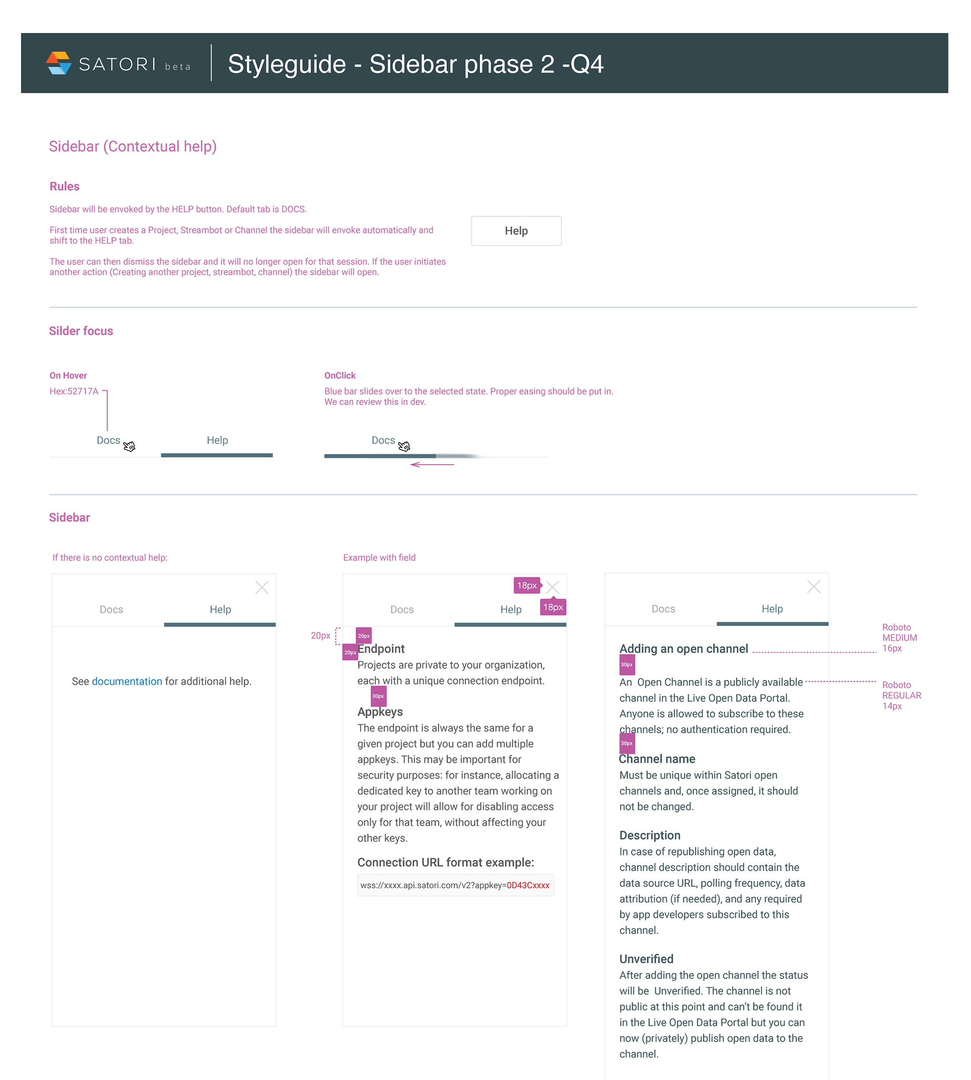
Sidebar for documentation needed space.
• Document break points
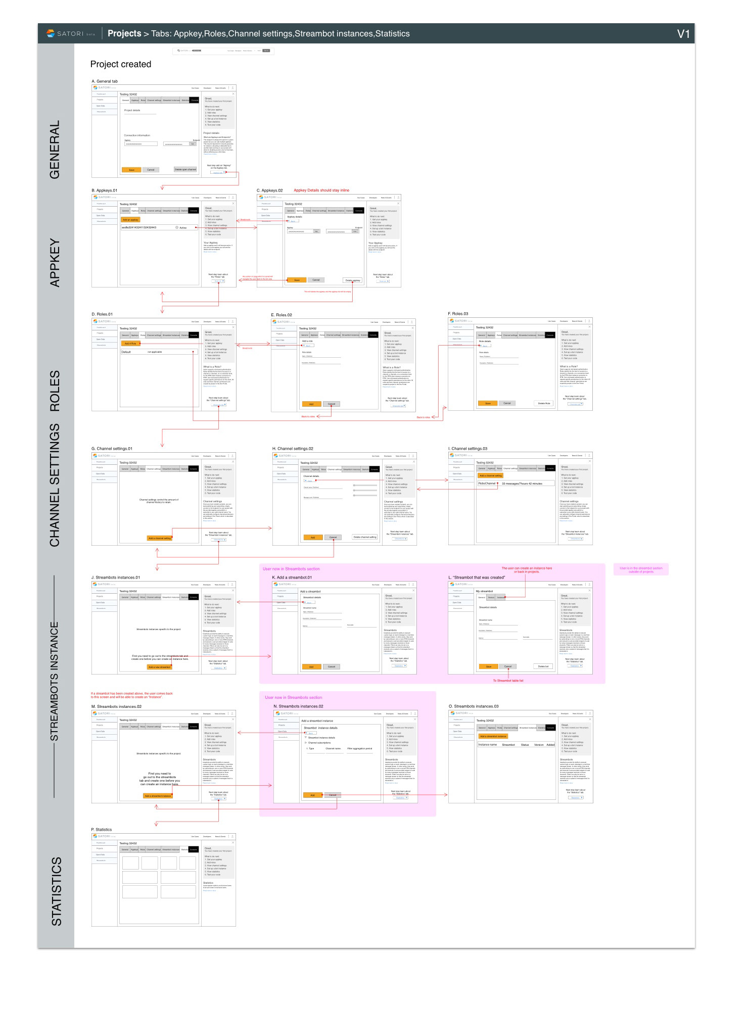
Site needed to be re-architected in order to achieve design goals.
• Create specifications for front end dev
Tabbed interface. User could click the tab and get contextual help. And or Search.
Sidebar for documentation needed space.
• Document break points
Site needed to be re-architected in order to achieve design goals.
• Create specifications for front end dev
Tabbed interface. User could click the tab and get contextual help. And or Search.


Map contextual onboarding
• Developer user experience
New user experience needs to be more intuitive and inviting.
• Move dev through project setup
Contextual sidebar help should changes based on what the user should do next.
• Easy navigation if steps skipped
Tabbed interface. User could click the tab and get contextual help. And or Search.
New user experience needs to be more intuitive and inviting.
• Move dev through project setup
Contextual sidebar help should changes based on what the user should do next.
• Easy navigation if steps skipped
Tabbed interface. User could click the tab and get contextual help. And or Search.

Sidebar specifications
• How does it interact
When does it appear, disappear?
• What options should be available
Help tab shows when a user is selecting different areas of the portal.
When does it appear, disappear?
• What options should be available
Help tab shows when a user is selecting different areas of the portal.

Before
• Confusing starting points
We found that developers wanted to dive into documentation and start a project first. In our current design it was disaggregated.
We found that developers wanted to dive into documentation and start a project first. In our current design it was disaggregated.
• Non scaleable framework
Non responsive, no room for help documentation unless opening a separate window.
• Dashboard data unclear
News and areas where developers could get inspired to build.
Non responsive, no room for help documentation unless opening a separate window.
• Dashboard data unclear
News and areas where developers could get inspired to build.
• Non inspiring
Developers did not have ideas on what to build, lacked inspiration.
Developers did not have ideas on what to build, lacked inspiration.

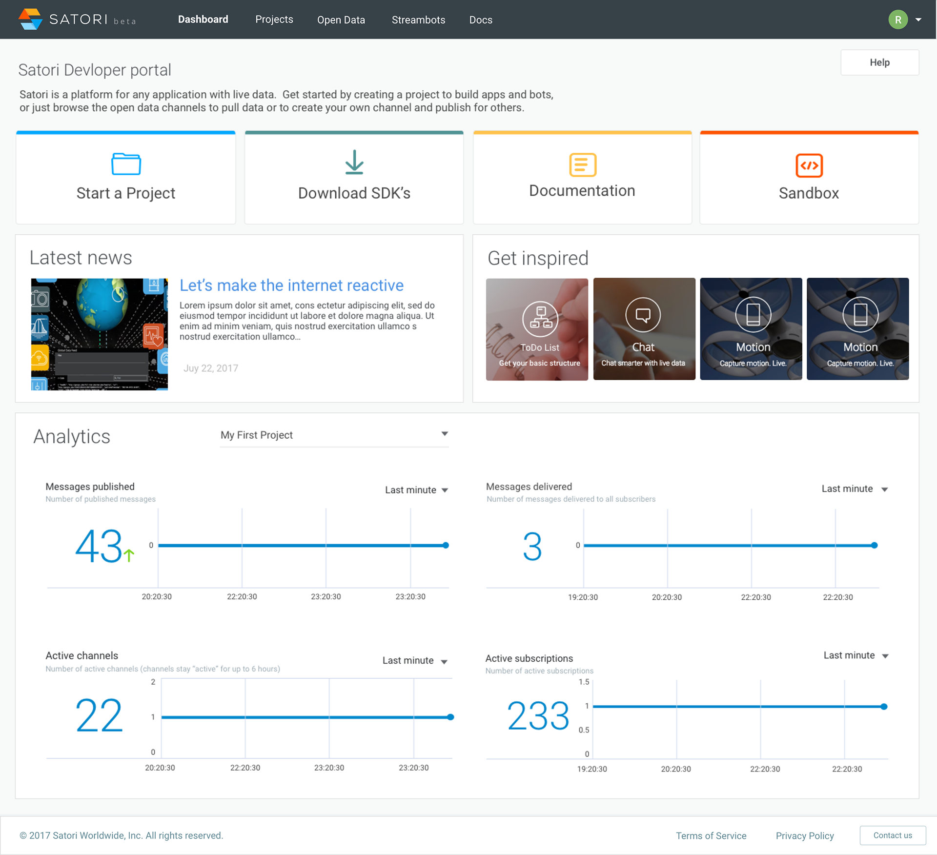
After
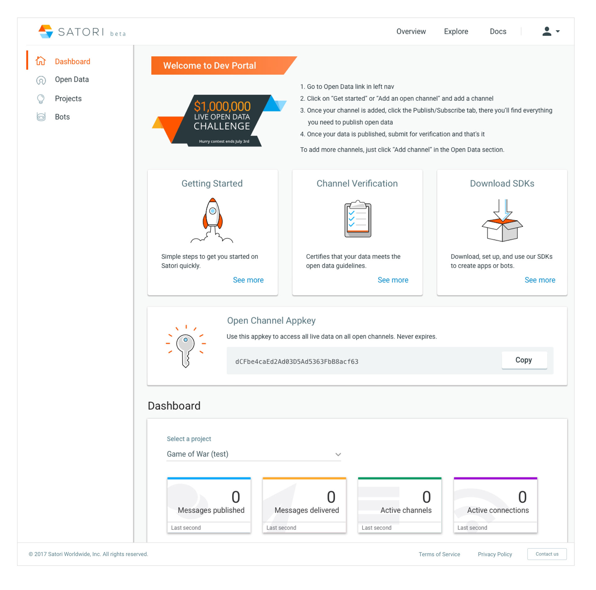
• Main use cases prominent
Top main functions shown across the top.
Top main functions shown across the top.
• One click access to view SDK’s and sandbox
One click access to download and code views, prior they were buried.
One click access to download and code views, prior they were buried.
• Inspiration and news
News and areas where developers could get inspired to build.
• Live analytics
Analytics dashboard of their current apps that they are working on, designed to work above the fold on a laptop and responsive.
Analytics dashboard of their current apps that they are working on, designed to work above the fold on a laptop and responsive.

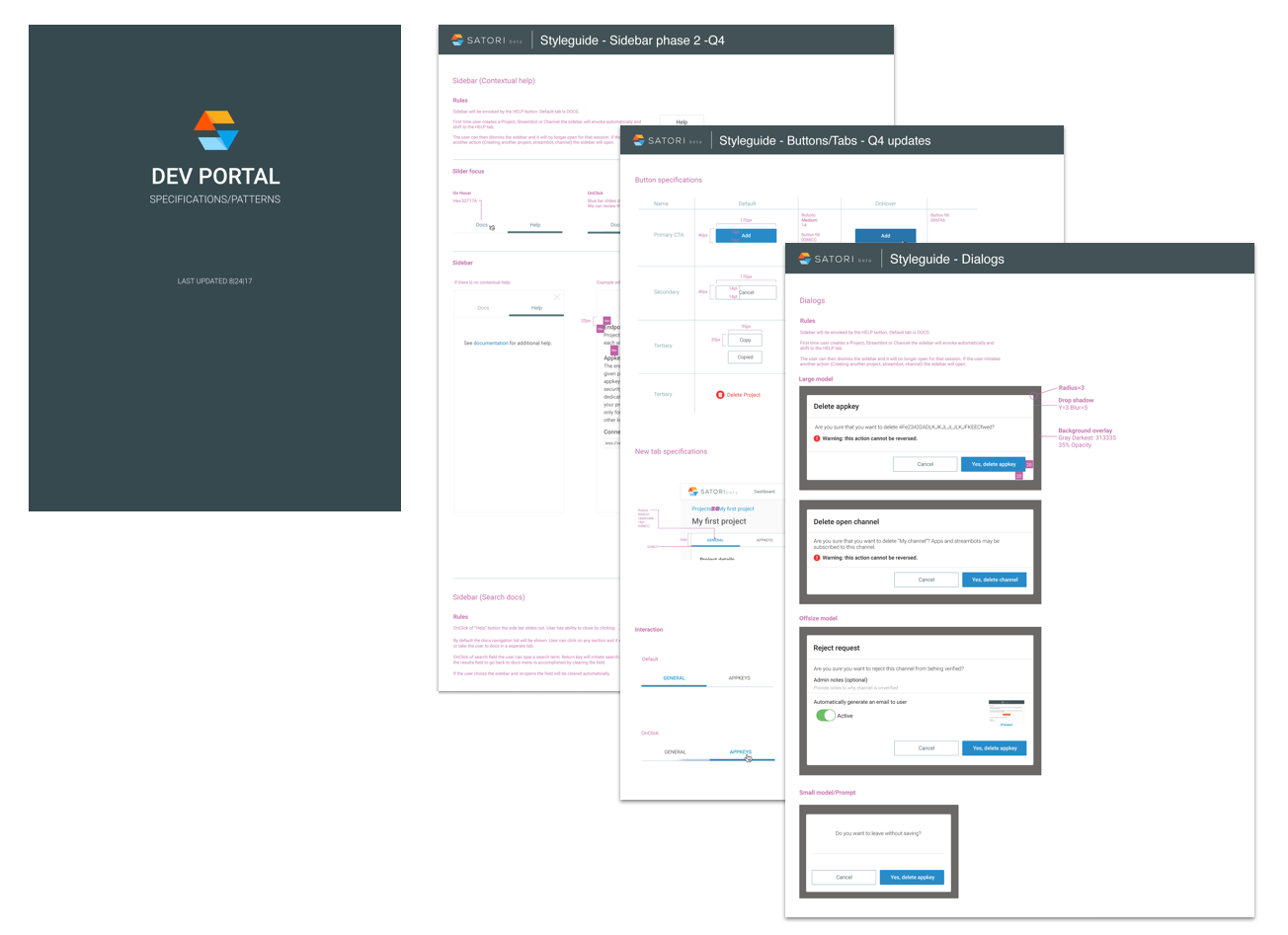
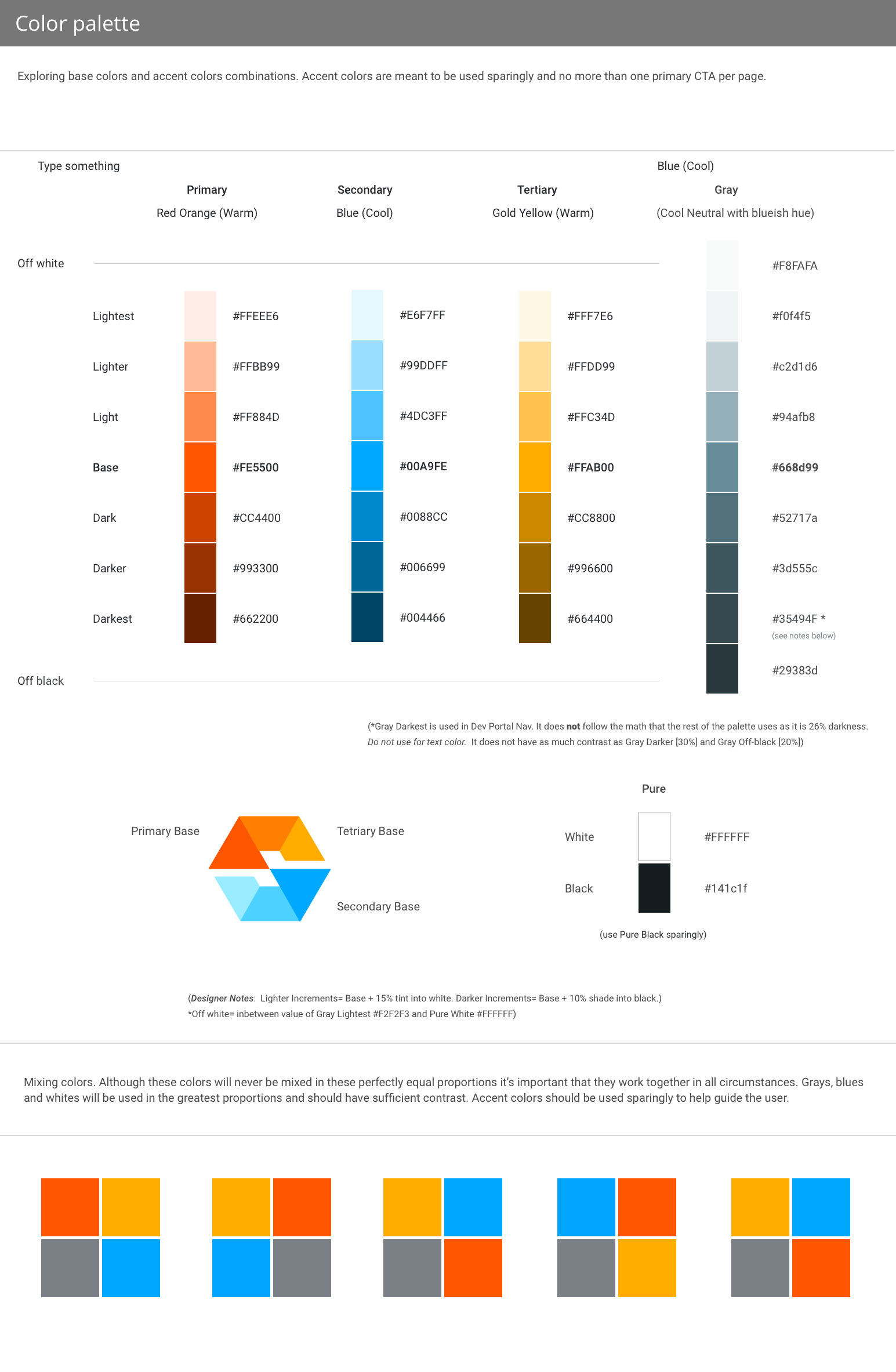
Samples of full style guide created
High level walkthrough
For full site and login visit: www.satori.com