Project: Yahoo! Re-design Member Center
2007-2009 "Old School Days"
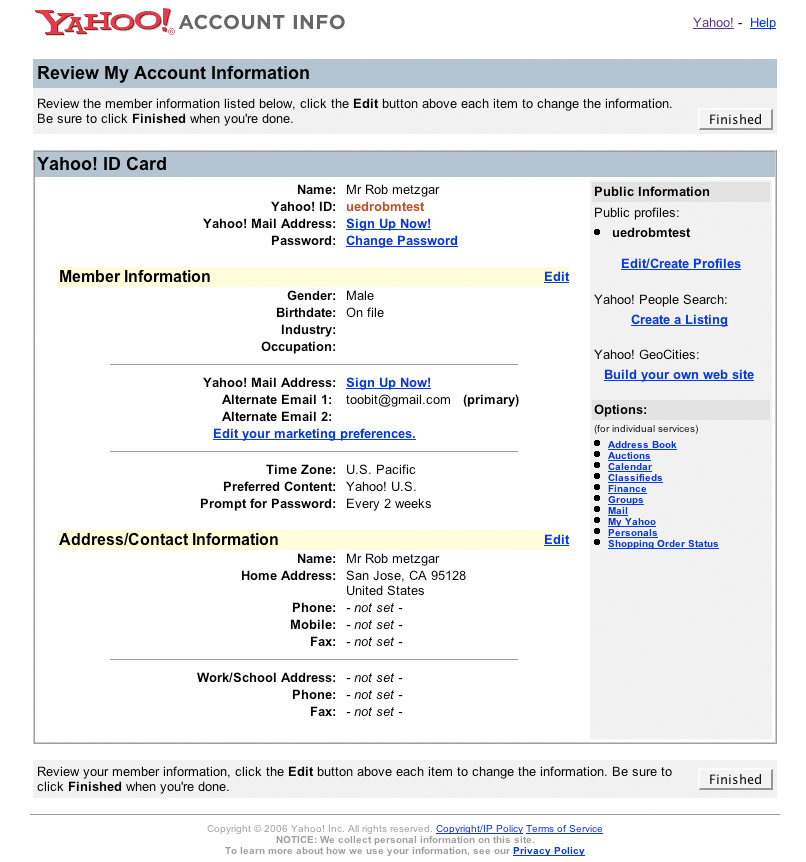
The current Yahoo! Membership center with a more updated UX. The current design at the time was over 10 years old.
My role
Full hands on re-design and visual design of Yahoo! Member Center and projects that the Membership team owned.
Full hands on re-design and visual design of Yahoo! Member Center and projects that the Membership team owned.
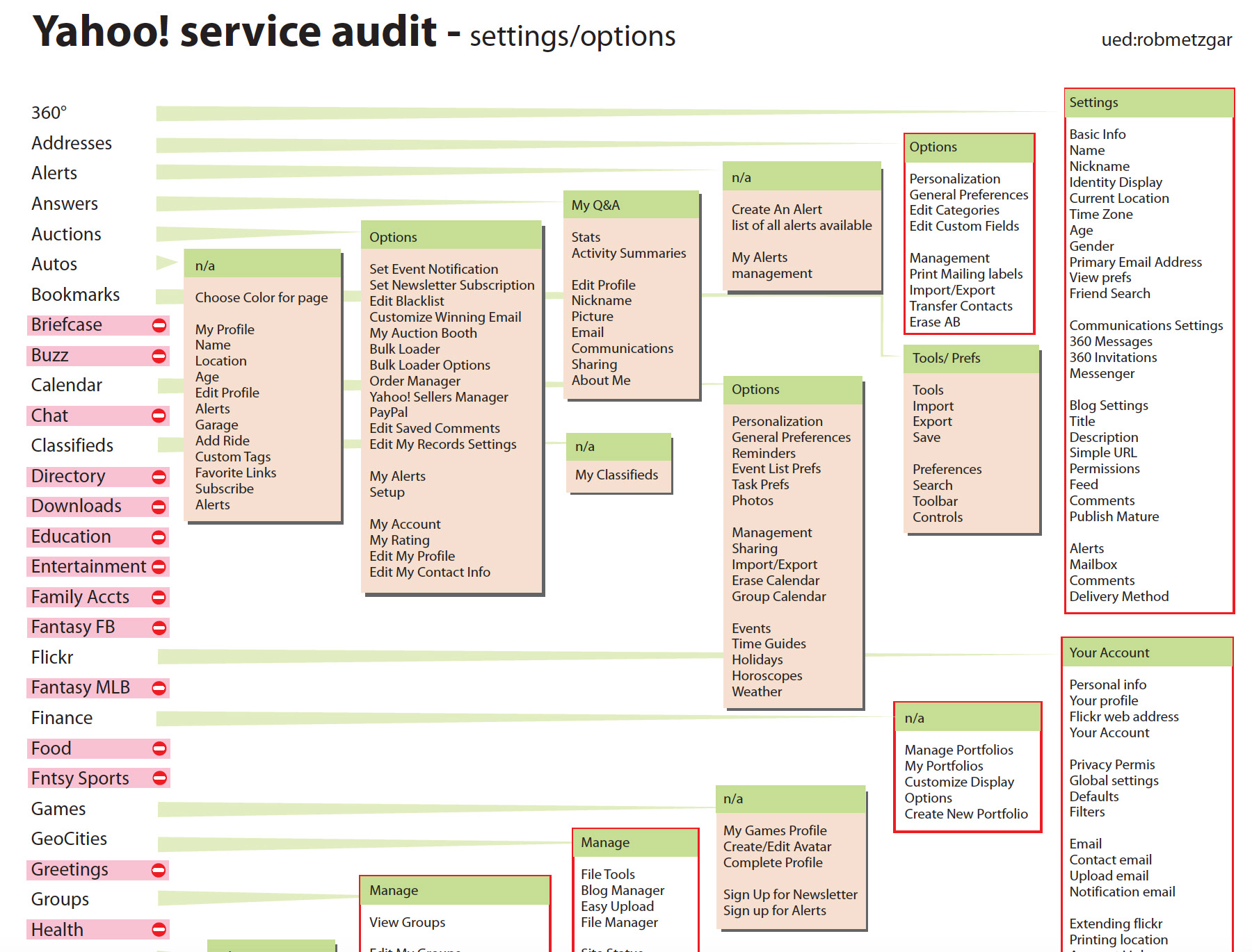
Since the current Membership UI was very outdated, and many products now connect to it, the challenge was to simplify the entry points and create a HUB like experience. First challenge was to audit all the services and properties that enter Membership accounts. Second challenge was to make the experience consistent with all the other various screens and experiences that touch the HUB. Connecting over 30 properties, working with various UX teams and providing solutions that worked for all were continuous hurdles.
The visual design was quite basic and designed with styleguides in mind. This project was primarily interaction design and managing the Yahoo! system of products.
Original Yahoo! Member Center.
Approach
The first step in the process was to audit all of the Yahoo! services that touched the member center. There were over 50 touch points that had to be mapped in order to collaborate with all the services within Yahoo! I was tasked to reach out to the various teams with the concept approach and provide a location for the services that would not disrupt their current flow.
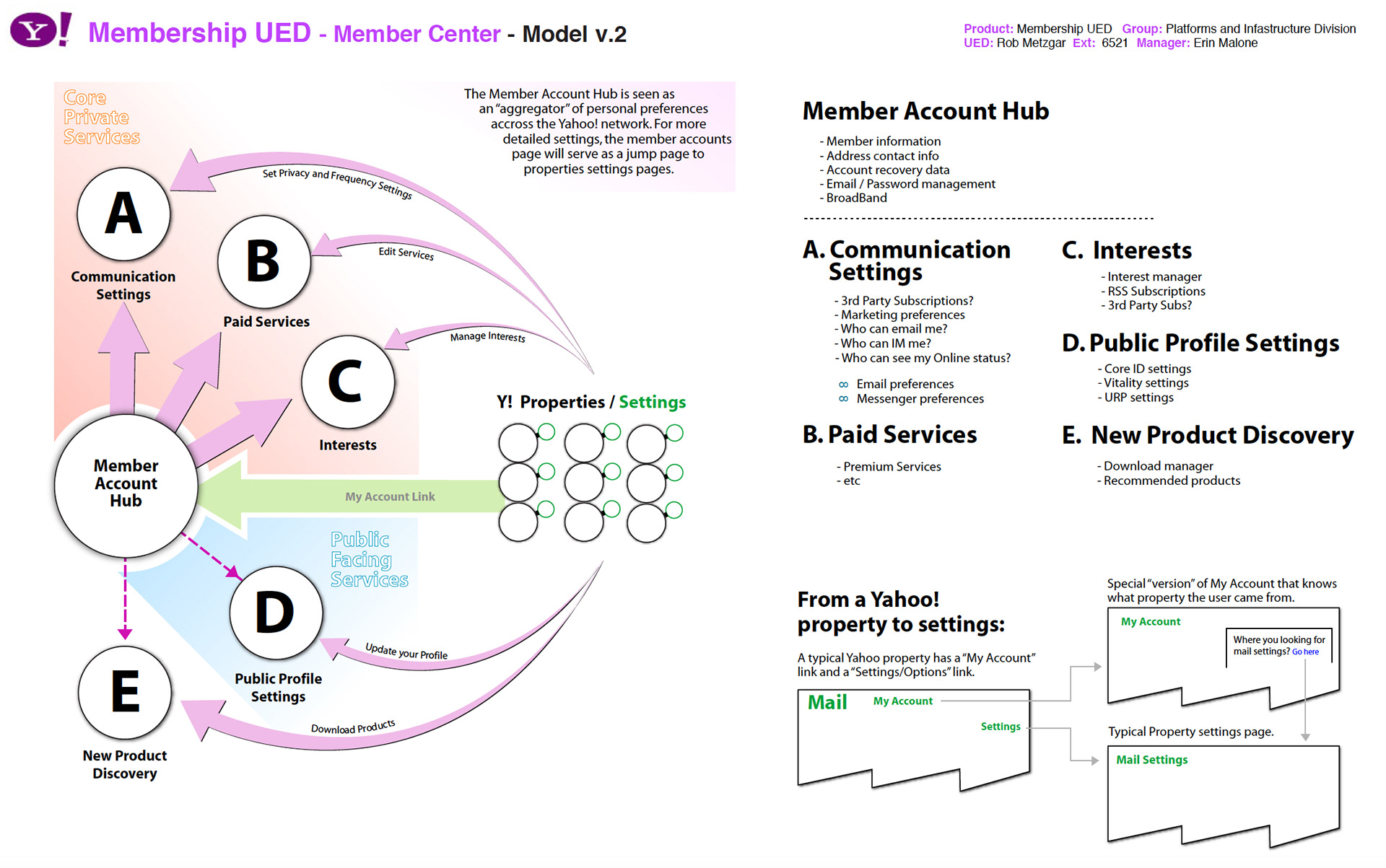
Build a new framework
The next step was to build a framework that would be a central point of communication for the members where they could easily get to touch points previously used without much disruption. Below is an example of the infographic I made for discussion to describe the new hub.
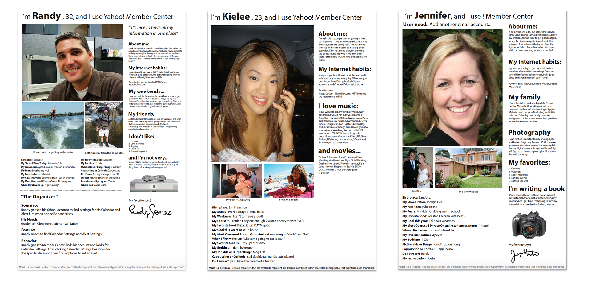
Sample User personas created prior to design. The three personas created had range of ages and styles that the design needed to adhere to. Each persona helped me visualize our user base before testing in labs on concept designs. A common practice was to talk about the personas in all our meetings as if we were the voice of the user.
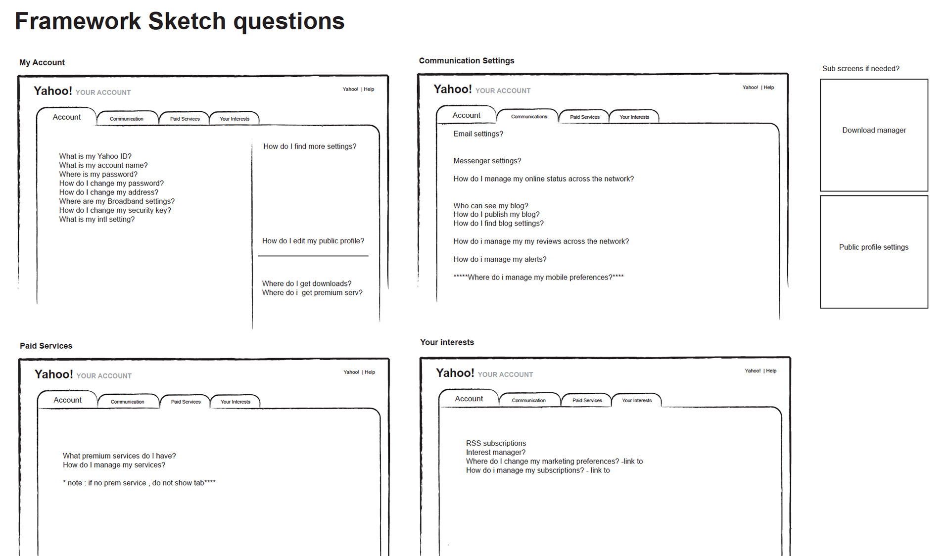
The beginning of frameworks
The next step was to ask the most frequent questions and categorize them in a way that users would know how to find what they needed within a choice of 4 tabs. I chose this approach at the time because it was the most elegant way to bucket the services needed and give permissions to the proper groups that would develop that area.
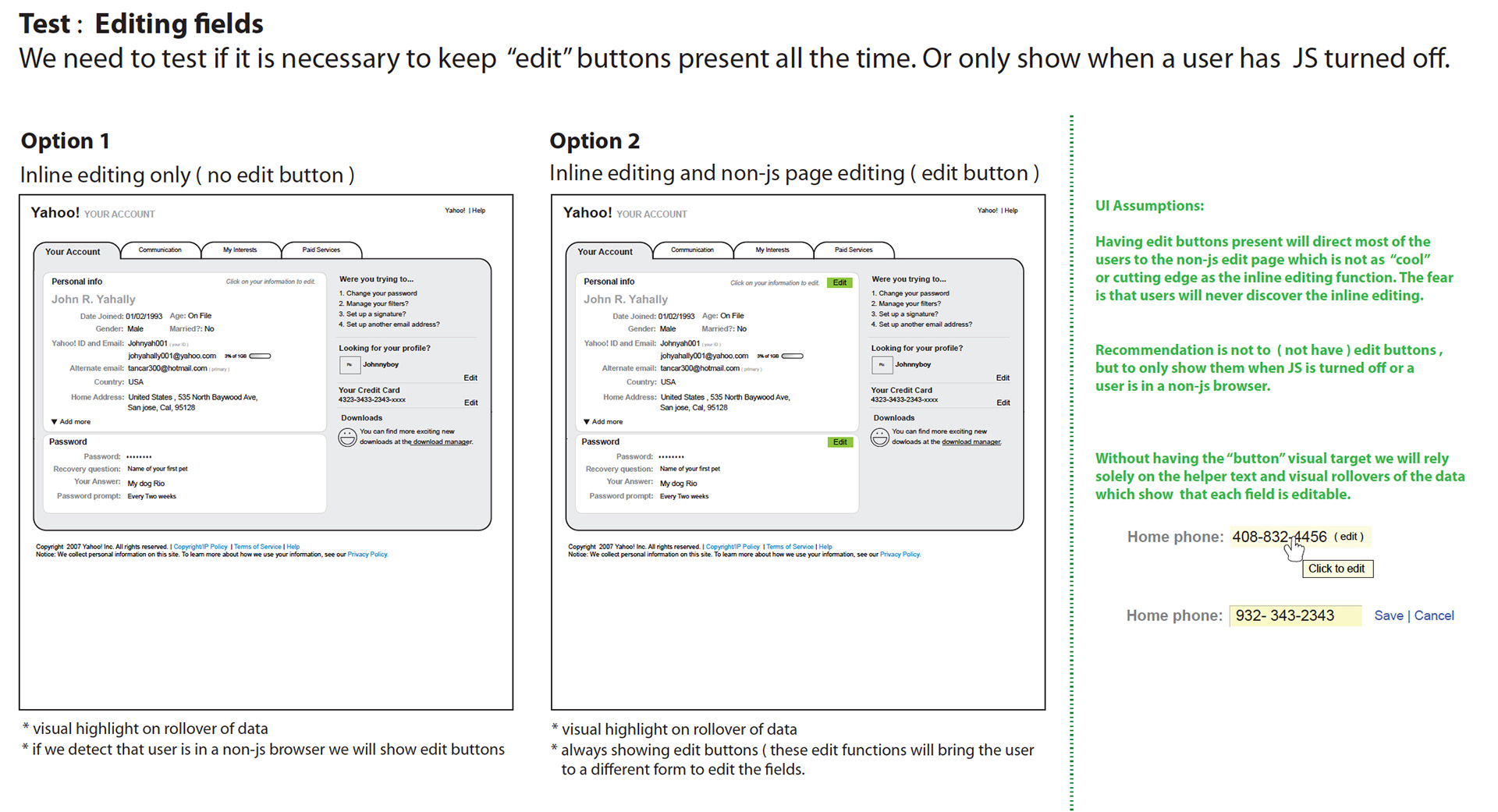
Wireframing and testing
As started to layout the requirements, we tested various methods on how to edit the data that users would be looking for within all the services. We needed up going with a click-to-edit approach that would keep the page clean of edit buttons.
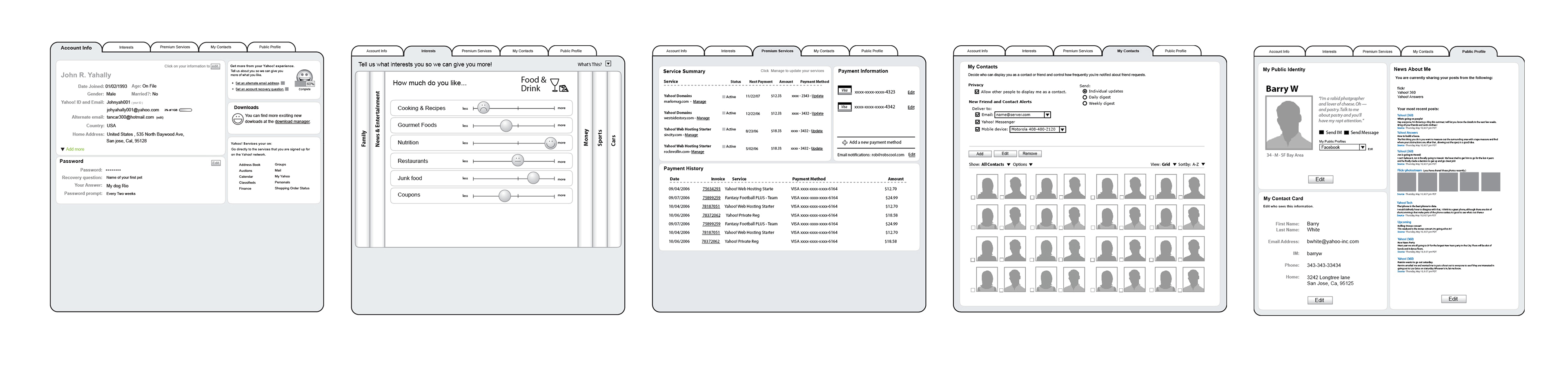
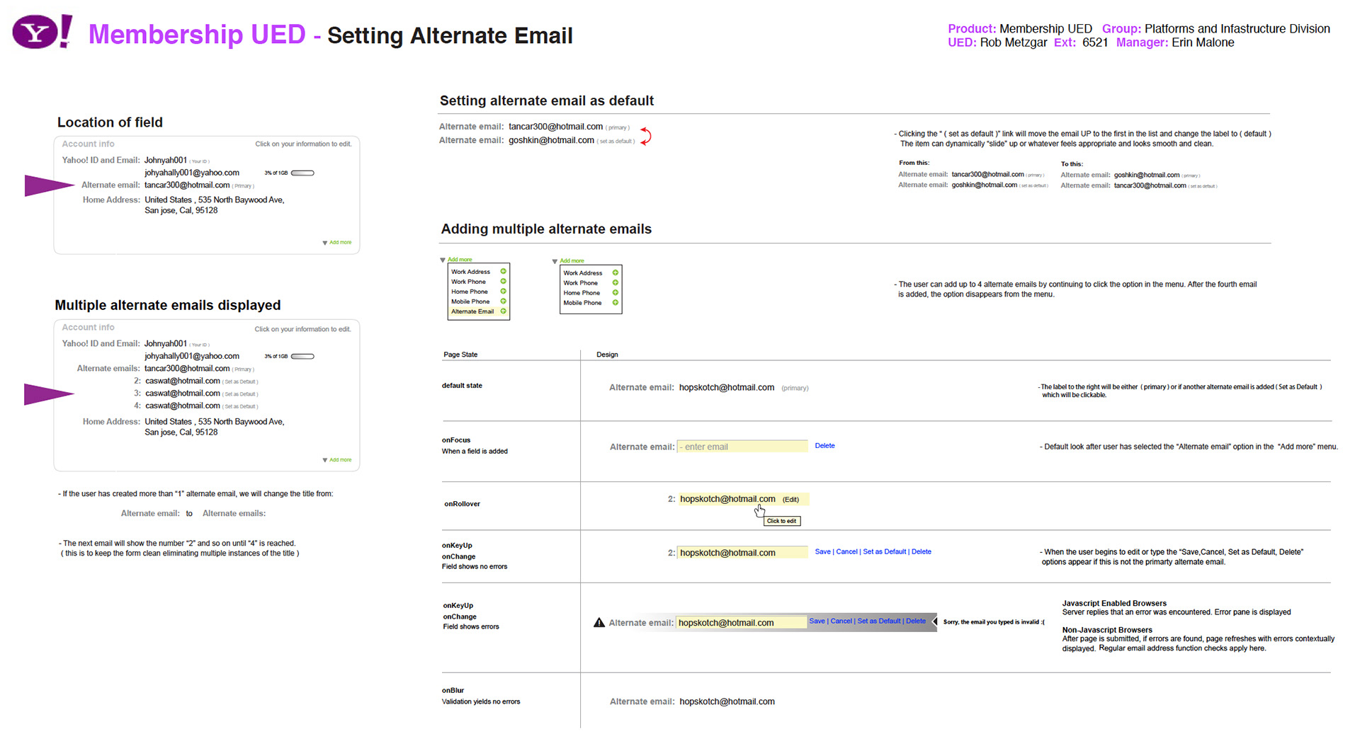
Sample specifications
Specifications were made for all the various field level interactions and delivered to development. Below is a sample.
Outcome
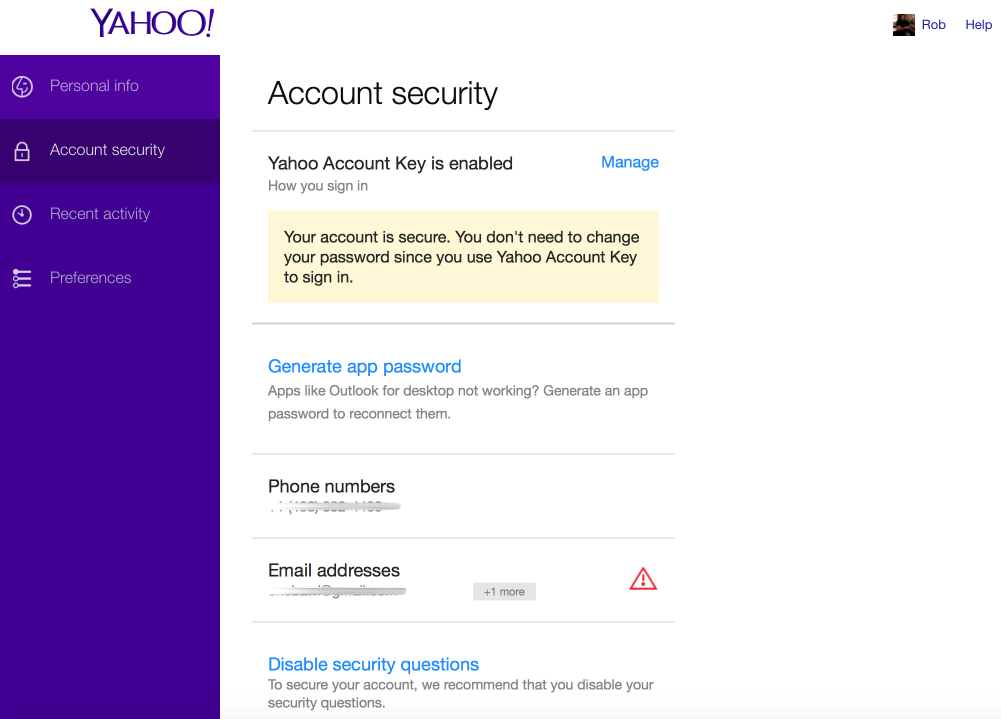
In the year I worked on this project it went through various iterations and visual changes. In the end, the style that you see today is where it currently is at below. Most of the services were taken out and put in the each product area. In the latest rendition Yahoo! changed from a top tab approach to a sidebar to fit with the various style guides that are now in place.